
Introduction
Sliders are a series of frames where each frame can be scrolled through in sequence. The frames in a slider can be images, videos, or even HTML elements (like descriptions or comments). Sliders are present on many modern websites. Sliders are used by developers when they need to convey information about the website but don't want it to take up too much space.
For example, suppose a developer is developing a product website, then he may want to show testimonials or reviews to the user so that he can trust them and buy his product. The developer can create a slider where users can easily browse and read each review. The same can be done with product images, where a developer can create a slider of product images so that the user can have a 360-degree view of the product.
Prerequisites
We will learn how to create a basic CSS image slider using HTML, CSS, and JavaScript. To fully understand what is going on and what we are doing, there are certain concepts that you need to know beforehand. Let's take a look at them.
- HTML: You should have basic knowledge of HTML like elements and tags. We will be using a variety of tags and elements to create a slider, so you should know what the role of each tag or element is in our slider.
- CSS: We will be using CSS extensively to create the slider. You should be aware of several intermediate CSS concepts like stacking, z-index, position, and animations. All of these will be needed when creating the slider.
- JavaScript: You should be aware of basic JavaScript like variable declaration, using for loop and DOM manipulation. These are used to manipulate the slider and create effects.
Once you're familiar with all these concepts, let's create a slider. We'll go through each concept step by step and why we do what we do.
Step 1: Create a basic image slider layout using HTML code
Let's create the basic skeleton of our slider. As we told you above, sliders are a collection of frames. We will create a CSS image slider.
First, we create the parent div that contains the slider images and functionality. We also add some styling like changing the background color and setting the height and width of the parent div.
<!DOCTYPE html>
<html>
<head>
<title>Slider in CSS</title>
<style>
</style>
</head>
<body>
<div id="parent-container">
<!-- This div will contain all images and buttons we will be using for Slider
-->
</div>
</body>
</html>
Once that's done, let's move on to the next part.
Step 2: Add Previous and Next Buttons
Sliders have two buttons, previous and next. These are used to navigate through the slider frames. We will add basic buttons to our parent section. These buttons will help the user navigate through the images in the carousel. For simplicity, we will use < and > as the button text, which represent previous and next respectively.
In addition to adding the basic HTML buttons, we will also slightly tweak them to be vertically aligned wrt center div. This is done so that scrolling through the slider becomes easier. We will use relative positioning to vertically align the buttons.
<!DOCTYPE html>
<html>
<head>
<title>Slider in CSS</title>
<style>

body{
background-color: rgb(58, 58, 58);
margin-top: 100px;
}
.carousel-container {
width: 600px;
height: 400px;
position: relative;
margin: 0 auto;

}

.navigation-buttons .previous {
position: absolute;
z-index: 10;
font-size: 25px;
top: 40%;
left: 10px;
font-weight: 700;
}

.navigation-buttons .next {
right: 10px;
position: absolute;
font-size: 25px;
z-index: 10;
top: 40%;
}

.navigation-buttons .nav-btn {
background: rgba(255, 255, 255, 0.55);
cursor: pointer;
border-radius: 50%;
width: 30px;
height: 30px;
display: flex;
justify-content: center;
align-items: center;
padding: 5px;
box-shadow: 2px 2px 10px rgba(0, 0, 0, 0.4);
}

.navigation .nav-btn:hover {
background: white;
}

</style>
</head>
<body>

<div id="parent-container">

<div class="navigation-buttons">
<div class="previous nav-btn"><</div>
<div class="next nav-btn">></div>
</div>

</div>

</body>
</html>
Output
Step 3: Add the required images and text to the slider
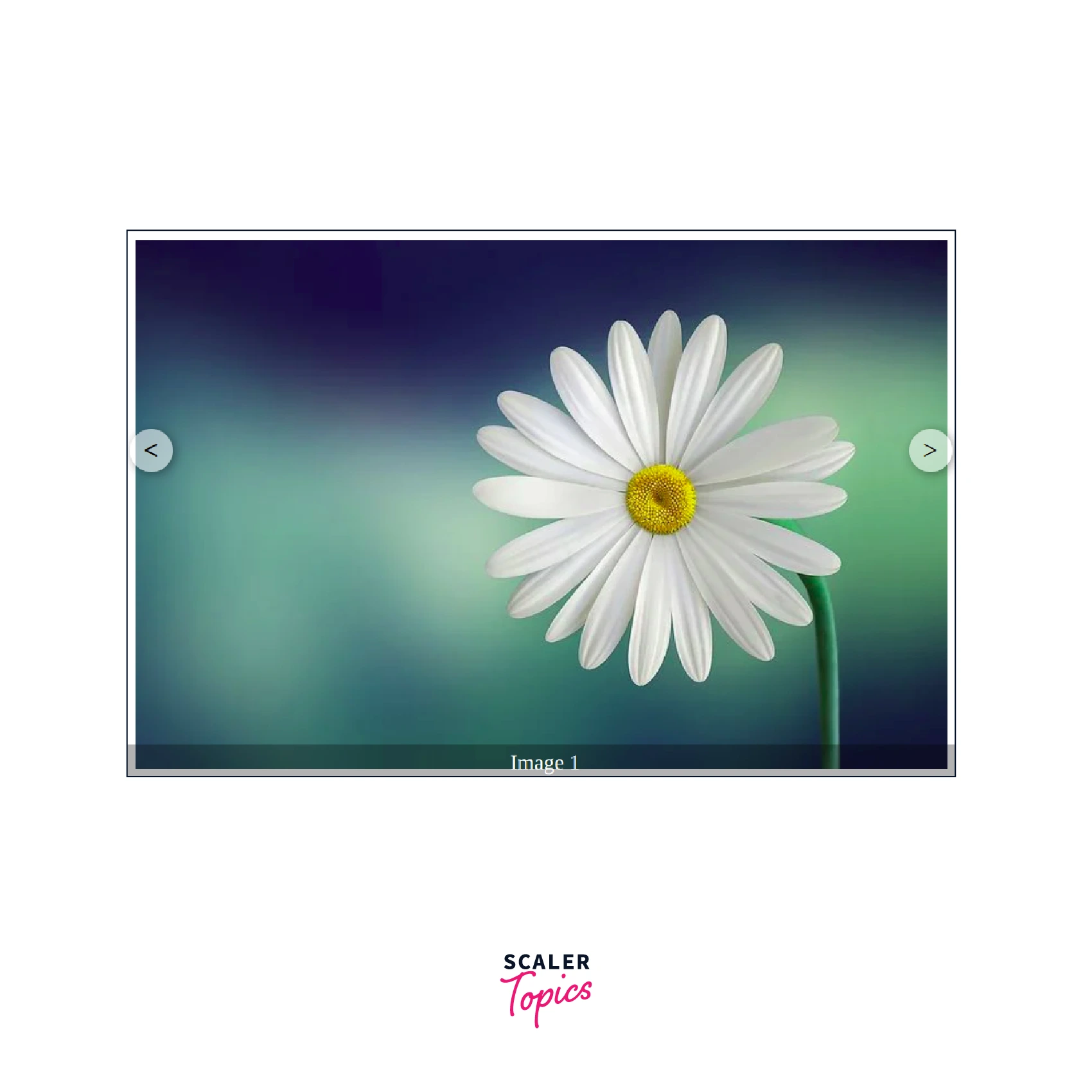
Once we have added the buttons, it is now time to add the images. We will use the flower images to create a CSS image slider. The images will be stacked on top of each other with the help of position and z-index. Since we only need one image to be visible, we will use a base class and set its visibility to visible. The rest of the images will be hidden to prevent them from being displayed to the user.
The slider also has text that shows which image the user is currently viewing. This helps the user get an idea of how many images are in the carousel and their order.
<!DOCTYPE html>
<html>
<head>
<title>Slider in CSS</title>
<style>

body{
background-color: rgb(58, 58, 58);
margin-top: 100px;
}
.carousel-container {
width: 600px;
height: 400px;
position: relative;
margin: 0 auto;

}

.navigation-buttons .previous {
position: absolute;
z-index: 10;
font-size: 25px;
top: 40%;
left: 10px;
font-weight: 700;
}

.navigation-buttons .next {
right: 10px;
position: absolute;
font-size: 25px;
z-index: 10;
top: 40%;
}

.navigation-buttons .nav-btn {
background: rgba(255, 255, 255, 0.55);
cursor: pointer;
border-radius: 50%;
width: 30px;
height: 30px;
display: flex;
justify-content: center;
align-items: center;
padding: 5px;
box-shadow: 2px 2px 10px rgba(0, 0, 0, 0.4);
}

.navigation .nav-btn:hover {
background: white;
}

.slider-carousel {
margin-top: 20px;
transition: all 0.3s ease;

}
.slider-carousel img {
width: 100%;
transition: all 0.3s ease;
border:8px solid white;
}

.images {
position: absolute;
display: none;
}

.main {
display: block;
}

.image-text {
position: absolute;
bottom: 0;
width: 103%;
display: flex;
font-size: 20px;
justify-content: center;
align-items: center;
color: rgb(255, 255, 255);
background: rgba(0, 0, 0, 0.3);
height: 35px;
}

</style>
</head>
<body>

<div id="parent-container">
<div class="navigation-buttons">
<div class="previous nav-btn"><</div>
<div class="next nav-btn">></div>
</div>

<div class="slider-carousel">
<div class="images main">
<img src="https://cdn.pixabay.com/photo/2015/04/19/08/32/marguerite-729510__480.jpg" alt="flower 1" />
<div class="image-text">Image 1</div>
</div>
<div class="images">
<img src="https://cdn.pixabay.com/photo/2014/02/27/16/10/tree-276014_960_720.jpg" alt="flower 2" />
<div class="image-text">Image 2</div>
</div>
<div class="images">
<img src="https://cdn.pixabay.com/photo/2015/04/23/22/00/tree-736885_960_720.jpg" alt="flower 3" />
<div class="image-text">Image 3</div>
</div>
</div>
</div>
</body>
</html>
Output
Step 4: Enable the two buttons using JavaScript code
We have created our slider class and added all the images to it. Now we need to enable the previous and next buttons. We will use JavaScript.
First, we need to add an event listener to these buttons. Every time the user clicks on the previous or next button, an action related to that button should be performed. So how are we going to do this?
We have used the main class to indicate which image should be visible to the user. We need to control which image has this class. Any other image will be hidden and only the image with the main class will be visible to the user. To achieve this, we will use DOM manipulation. DOM manipulation helps us to remove the main class from an existing image and add it to a new image.
Now to determine which image should have the main class, we use the event listeners of the previous and next buttons. First we need to get all the images in the slider. We can see that the parent slider carousel has a split of images. We can get this using the Query Selector in the DOM. Now when we have all the image divs, we need to select the appropriate one and add the main class to it. The rest will not have a main class and hence will be invisible to the user. We can initialize a variable that initially points to 0. This variable tells us which image is currently visible to the user. Every time the user clicks on next or previous, we increment or decrement the value of the variable accordingly. If the value is 0 and the user clicks on the previous value, we change the value to (number of images in the div - 1). Similarly, if the variable is on the last image and the user clicks on next, we change the value to 0.
<!DOCTYPE html>
<html>
<head>
<title>Slider in CSS</title>
<style>

body{
background-color: rgb(58, 58, 58);
margin-top: 100px;
}
.carousel-container {
width: 600px;
height: 400px;
position: relative;
margin: 0 auto;

}

.navigation-buttons .previous {
position: absolute;
z-index: 10;
font-size: 25px;
top: 40%;
left: 10px;
font-weight: 700;
}

.navigation-buttons .next {
right: 10px;
position: absolute;
font-size: 25px;
z-index: 10;
top: 40%;
}

.navigation-buttons .nav-btn {
background: rgba(255, 255, 255, 0.55);
cursor: pointer;
border-radius: 50%;
width: 30px;
height: 30px;
display: flex;
justify-content: center;
align-items: center;
padding: 5px;
box-shadow: 2px 2px 10px rgba(0, 0, 0, 0.4);
}

.navigation .nav-btn:hover {
background: white;
}

.slider-carousel {
margin-top: 20px;
transition: all 0.3s ease;

}
.slider-carousel img {
width: 100%;
transition: all 0.3s ease;
border:8px solid white;
}

.images {
position: absolute;
display: none;
}

.main {
display: block;
}

.image-text {
position: absolute;
bottom: 0;
width: 103%;
display: flex;
font-size: 20px;
justify-content: center;
align-items: center;
color: rgb(255, 255, 255);
background: rgba(0, 0, 0, 0.3);
height: 35px;
}

</style>
</head>
<body>

<div id="parent-container">

<div class="navigation-buttons">
<div class="previous nav-btn"><</div>
<div class="next nav-btn">></div>
</div>

<div class="slider-carousel">
<div class="images main">
<img src="https://cdn.pixabay.com/photo/2015/04/19/08/32/marguerite-729510__480.jpg" alt="flower 1" />
<div class="image-text">Image 1</div>
</div>
<div class="images">
<img src="https://cdn.pixabay.com/photo/2014/02/27/16/10/tree-276014_960_720.jpg" alt="flower 2" />
<div class="image-text">Image 2</div>
</div>
<div class="images">
<img src="https://cdn.pixabay.com/photo/2015/04/23/22/00/tree-736885_960_720.jpg" alt="flower 3" />
<div class="image-text">Image 3</div>
</div>
</div>

</div>

<script>

const previous = document.querySelector('.previous');
const next = document.querySelector('.next');
const images = document.querySelector('.slider-carousel').children;
const totalImages = images.length;
let currentIndex = 0;


// Event Listeners to previous and next buttons
previous.addEventListener('click', () => {
previousImage()
})

next.addEventListener('click', () => {
nextImage();
})


// Function to go to next Image
function nextImage(){

images[currentIndex].classList.remove('main');
if(currentIndex == totalImages-1){
currentIndex = 0;
}
else{
currentIndex++;
}

images[currentIndex].classList.add('main');

}

// Function to go to previous Image
function previousImage(){

images[currentIndex].classList.remove('main');
if(currentIndex == 0){
currentIndex = totalImages-1;
}
else{
currentIndex--;
}

images[currentIndex].classList.add('main');

}

</script>

</body>
</html>
Output

Congratulations, you have created a CSS slider using HTML, CSS, and JavaScript.
Slideshow function
Our Slider currently uses manual control to work. That is, the image will not change until the user clicks the previous or next button. However, most sliders available online do not work this way. They have a slideshow effect that allows them to automatically change frames after a set amount of time.
We can also do this in our slider. Using JavaScript we can use the setInterval function which automatically calls the next function after a specified time. This helps the slider to work automatically and change the slider after the specified time.
<!DOCTYPE html>
<html>
<head>
<title>Slider in CSS</title>
<style>

body{
background-color: rgb(58, 58, 58);
margin-top: 100px;
}
.carousel-container {
width: 600px;
height: 400px;
position: relative;
margin: 0 auto;

}

.navigation-buttons .previous {
position: absolute;
z-index: 10;
font-size: 25px;
top: 40%;
left: 10px;
font-weight: 700;
}

.navigation-buttons .next {
right: 10px;
position: absolute;
font-size: 25px;
z-index: 10;
top: 40%;
}

.navigation-buttons .nav-btn {
background: rgba(255, 255, 255, 0.55);
cursor: pointer;
border-radius: 50%;
width: 30px;
height: 30px;
display: flex;
justify-content: center;
align-items: center;
padding: 5px;
box-shadow: 2px 2px 10px rgba(0, 0, 0, 0.4);
}

.navigation .nav-btn:hover {
background: white;
}

.slider-carousel {
margin-top: 20px;
transition: all 0.3s ease;

}
.slider-carousel img {
width: 100%;
transition: all 0.3s ease;
border:8px solid white;
}

.images {
position: absolute;
display: none;
}

.main {
display: block;
}

.image-text {
position: absolute;
bottom: 0;
width: 103%;
display: flex;
font-size: 20px;
justify-content: center;
align-items: center;
color: rgb(255, 255, 255);
background: rgba(0, 0, 0, 0.3);
height: 35px;
}

</style>
</head>
<body>

<div id="parent-container">

<div class="navigation-buttons">
<div class="previous nav-btn"><</div>
<div class="next nav-btn">></div>
</div>

<div class="slider-carousel">
<div class="images main">
<img src="https://cdn.pixabay.com/photo/2015/04/19/08/32/marguerite-729510__480.jpg" alt="flower 1" />
<div class="image-text">Image 1</div>
</div>
<div class="images">
<img src="https://cdn.pixabay.com/photo/2014/02/27/16/10/tree-276014_960_720.jpg" alt="flower 2" />
<div class="image-text">Image 2</div>
</div>
<div class="images">
<img src="https://cdn.pixabay.com/photo/2015/04/23/22/00/tree-736885_960_720.jpg" alt="flower 3" />
<div class="image-text">Image 3</div>
</div>
</div>

</div>

<script>

const previous = document.querySelector('.previous');
const next = document.querySelector('.next');
const images = document.querySelector('.slider-carousel').children;
const totalImages = images.length;
let currentIndex = 0;


// Event Listeners to previous and next buttons
previous.addEventListener('click', () => {
previousImage()
})

next.addEventListener('click', () => {
nextImage();
})

setInterval(()=>{
nextImage();
},1000);

// Function to go to next Image
function nextImage(){

images[currentIndex].classList.remove('main');
if(currentIndex == totalImages-1){
currentIndex = 0;
}
else{
currentIndex++;
}

images[currentIndex].classList.add('main');

}

// Function to go to previous Image
function previousImage(){

images[currentIndex].classList.remove('main');
if(currentIndex == 0){
currentIndex = totalImages-1;
}
else{
currentIndex--;
}

images[currentIndex].classList.add('main');

}

</script>

</body>
</html>
Output
Navigation points
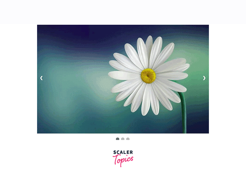
Apart from using a title or image text in your slider, you can also use navigation dots. Navigation dots work similarly to text or a title. They tell the user which frame they are currently on. Navigation dots are used in many modern sliders because they are convenient and easy to create. Navigation dots are mostly radio buttons.
The advantage of using navigation points is that it allows the user to access each frame of the slider without any hassle. Unlike a traditional slider where the user has to access each image one by one, navigation points allow the user to visit each frame or image by clicking on the navigation point corresponding to that image.
The basic principle behind navigation points is similar to sliding images. The current image will have a corresponding navigation button that has an active class. After the image changes, the active class is moved or added to the current image and the current navigation point.
<!DOCTYPE html>
<html>
<head>
<meta name="viewport" content="width=device-width, initial-scale=1">
<style>
* {box-sizing: border-box}

body {font-family: Verdana, sans-serif; margin:0}

.images {display: none}

img {
vertical-align: middle;
width:100%;
}

/* Slideshow container */
.carousel-container {
max-width: 1000px;
position: relative;
margin: auto;
}

/* Next & previous buttons */
.previous, .next {
cursor: pointer;
position: absolute;
top: 50%;
width: auto;
padding: 16px;
margin-top: -22px;
color: white;
font-weight: bold;
font-size: 18px;
transition: 0.6s ease;
border-radius: 0 3px 3px 0;
user-select: none;
}

/* Position the "next button" to the right */
.next {
right: 0;
border-radius: 3px 0 0 3px;
}


/* On hover, add a black background color with a little bit seethrough */
.prev:hover, .next:hover {
background-color: rgba(0,0,0,0.8);
}


/* The dots/bullets/indicators */
.navigation-dot {
cursor: pointer;
height: 15px;
width: 15px;
margin: 0 2px;
background-color: #bbb;
border-radius: 50%;
display: inline-block;
transition: background-color 0.6s ease;
}
.active, .navigation-dot:hover {
background-color: #717171;
}
</style>
</head>
<body>
<div class="carousel-container">
<div class="images fade">
<img src="https://cdn.pixabay.com/photo/2015/04/19/08/32/marguerite-729510__480.jpg">
</div>
<div class="images fade">
<img src="https://cdn.pixabay.com/photo/2014/02/27/16/10/tree-276014_960_720.jpg">
</div>
<div class="images fade">
<img src="https://cdn.pixabay.com/photo/2015/04/23/22/00/tree-736885_960_720.jpg">
</div>

<!-- Previous and Next Buttons -->
<a class="previous" onclick="plusSlides(-1)">❮</a>
<a class="next" onclick="plusSlides(1)">❯</a>
</div>
<br>

<!-- Navigation Dots-->
<div style="text-align:center">
<span class="navigation-dot" onclick="currentSlide(1)"></span>
<span class="navigation-dot" onclick="currentSlide(2)"></span>
<span class="navigation-dot" onclick="currentSlide(3)"></span>
</div>
<script>
var currentIndex = 1;

//Show current image
showSlides(currentIndex);

//Function to move Next
function plusSlides(n) {
showSlides(currentIndex += n);
}

//Function to move back
function currentSlide(n) {
showSlides(currentIndex = n);
}


//Initiate moving of slides
function showSlides(n) {
var i;
var slides = document.getElementsByClassName("images");
var dots = document.getElementsByClassName("navigation-dot");
if (n > slides.length) {currentIndex = 1}
if (n < 1) {currentIndex = slides.length}
for (i = 0; i < slides.length; i++) {
slides[i].style.display = "none";
}
for (i = 0; i < dots.length; i++) {
dots[i].className = dots[i].className.replace(" active", "");
}
slides[currentIndex-1].style.display = "block";
dots[currentIndex-1].className += " active";
}
</script>
</body>
</html>
Output

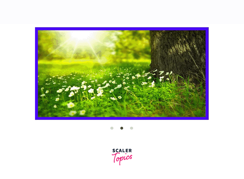
Alternative example
Sliders created using JavaScript are fine as long as JavaScript is enabled in the browser. As soon as the user turns off JavaScript, the slider will no longer work because it uses JavaScript to achieve the functionality of the slider.
You don't need to use JavaScript to create a slider. You can even create a slider using just HTML and CSS. All you need to understand is how it works when the user clicks the previous or next button. A slider created using HTML and CSS uses less browser memory and will work even if JavaScript is disabled in the browser.
You can use their attributes and properties to create an active class. For the navigation button, you can create an active class that will work when the button is clicked or hovered over. This works similar to JavaScript, however, instead of using DOM manipulation, we will use CSS functions like target etc. to achieve this.
We have created a sample slider for you using HTML and CSS. We have used pseudo-active classes like check to determine which navigation point the user has clicked on recently. Then we show the image to the user accordingly. For each image, we have set the margin and padding, since we are not hiding the images.
<!DOCTYPE html>
<html>

<head>
<title> Slider using HTML and CSS </title>
<style>

img{
height:100%;
width:100%;
}

#frame {
margin: 0 auto;
height:400px;
width: 600px;
max-width: 100%;
}

#frame input[type=radio] {

display: none;
}

#frame label {
cursor: pointer;
text-decoration: none;
}

#slides {
padding: 10px;
background: #00F;
position: relative;
z-index: 1;
}

#overflow {
width: 100%;
overflow: hidden;
}

#frame1:checked~#slides .inner {
margin-left: 0;
}

#frame2:checked~#slides .inner {
margin-left: -100%;
}

#frame3:checked~#slides .inner {
margin-left: -200%;
}

#slides .inner {
transition: margin-left 800ms
cubic-bezier(0.770, 0.000, 0.175, 1.000);
width: 400%;
line-height: 0;
height: 300px;
}

#slides .frame {
width: 25%;
float: left;
display: flex;
justify-content: center;
align-items: center;
height: 100%;
color: black;
}

#controls {
margin: -180px 0 0 0;
width: 100%;
height: 50px;
z-index: 3;
position: relative;
}

#controls label {
transition: opacity 0.2s ease-out;
display: none;
width: 50px;
height: 50px;
opacity: .4;
}

#controls label:hover {
opacity: 1;
}

/* active class for images*/
#frame1:checked~#controls label:nth-child(2),
#frame2:checked~#controls label:nth-child(3),
#frame3:checked~#controls label:nth-child(1){
float: right;
margin: 0 -50px 0 0;
display: block;
}

/* active class for navigation button*/
#frame1:checked~#controls label:nth-last-child(2),
#frame2:checked~#controls label:nth-last-child(3),
#frame3:checked~#controls label:nth-last-child(1){
float: left;
margin: 0 0 0 -50px;
display: block;
}

#bullets {
margin: 150px 0 0;
text-align: center;
}

#bullets label {
display: inline-block;
width: 10px;
height: 10px;
border-radius: 100%;
background: #ccc;
margin: 0 10px;
}

#frame1:checked~#bullets label:nth-child(1),
#frame2:checked~#bullets label:nth-child(2),
#frame3:checked~#bullets label:nth-child(3){
background: #444;
}

</style>
</head>

<body>
<div id="frame">
<input type="radio" name="frame" id="frame1" checked />
<input type="radio" name="frame" id="frame2" />
<input type="radio" name="frame" id="frame3" />
<div id="slides">
<div id="overflow">
<div class="inner">
<div class="frame">
<img src="https://cdn.pixabay.com/photo/2015/04/19/08/32/marguerite-729510__480.jpg">
</div>
<div class="frame">
<img src="https://cdn.pixabay.com/photo/2014/02/27/16/10/tree-276014_960_720.jpg">
</div>
<div class="frame">
<img src="https://cdn.pixabay.com/photo/2015/04/23/22/00/tree-736885_960_720.jpg">
</div>
</div>
</div>
</div>
<div id="controls">
<label for="frame1"></label>
<label for="frame2"></label>
<label for="frame3"></label>
</div>
<div id="bullets">
<label for="frame1"></label>
<label for="frame2"></label>
<label for="frame3"></label>
</div>
</div>
</body>

</html>
Output
Result
- Sliders are a series of frames where each frame can be scrolled through in sequence.
- They are used on many websites today to display comments or testimonials.
- To build a slider, the user must be aware of concepts like HTML tags, CSS concepts like stacking, positioning, etc., and basic JavaScript like variables and DOM manipulation.
- Sliders work by having an active class that is displayed on. The rest of the frames are displayed off. When the user hovers over a button or point, we change the element that has the active class using DOM manipulation.
- If the user does not have JavaScript enabled in the browser, the slider will not work.
- You can use only HTML and CSS to create a slider. This saves browser memory and computing time. It also works in any browser that supports HTML and CSS.