
導入
スライダーは、各フレームを順番にスクロールできる一連のフレームです。スライダーのフレームには、画像、動画、さらにはHTML要素(説明やコメントなど)を使用できます。スライダーは多くの最新のウェブサイトで採用されています。開発者は、ウェブサイトに関する情報を伝えたいものの、スペースをあまり取りたくない場合にスライダーを使用します。.
例えば、開発者が製品ウェブサイトを開発しているとします。ユーザーが製品を信頼して購入できるように、推薦文やレビューを表示したいとします。開発者は、ユーザーが各レビューを簡単に閲覧・確認できるスライダーを作成できます。製品画像についても同様に、開発者は製品画像のスライダーを作成し、ユーザーが製品を360度見渡せるようにすることができます。.
前提条件
HTML、CSS、JavaScriptを使って、基本的なCSS画像スライダーを作成する方法を学びます。ここで何が起こっているのか、何をしているのかを完全に理解するために、事前に知っておくべき概念がいくつかあります。それでは、それらを見てみましょう。.
- HTML: 要素やタグといったHTMLの基礎知識が必要です。スライダーを作成するために様々なタグや要素を使用するので、それぞれのタグや要素がスライダー内でどのような役割を果たすかを理解しておく必要があります。.
- CSS:スライダーの作成にはCSSを多用します。スタッキング、Zインデックス、位置、アニメーションといったCSSの中級レベルの概念を理解しておく必要があります。これらはすべて、スライダーの作成に必要になります。.
- JavaScript: 変数宣言、forループの使用、DOM操作といった基本的なJavaScriptの知識が必要です。これらはスライダーの操作やエフェクトの作成に使用されます。.
これらの概念をすべて理解したら、スライダーを作成しましょう。各概念を段階的に説明し、その理由を説明します。.
ステップ1: HTMLコードを使用して基本的な画像スライダーレイアウトを作成する
スライダーの基本的な骨組みを作りましょう。上で説明したように、スライダーはフレームの集合体です。CSS画像スライダーを作成します。.
まず、スライダー画像と機能を含む親div要素を作成します。また、背景色の変更や親div要素の高さと幅の設定など、スタイル設定も行います。.
<!DOCTYPE html>
<html>
<head>
<title>Slider in CSS</title>
<style>
</style>
</head>
<body>
<div id="parent-container">
<!-- This div will contain all images and buttons we will be using for Slider
-->
</div>
</body>
</html>
それが終わったら、次の部分に進みましょう。.
ステップ2: 「前へ」と「次へ」ボタンを追加する
スライダーには「前へ」と「次へ」の2つのボタンがあります。これらはスライダーフレーム間を移動するために使用します。親セクションに基本的なボタンを追加します。これらのボタンは、ユーザーがカルーセル内の画像間を移動するのに役立ちます。簡潔にするために、ボタンのテキストには「<」と「>」を使用します。それぞれ「前へ」と「次へ」を表します。.
基本的なHTMLボタンを追加するだけでなく、中央のdiv要素を基準に垂直方向に揃えるように少し調整します。これにより、スライダーのスクロールがしやすくなります。ボタンの垂直方向の配置には、相対位置指定を使用します。.
<!DOCTYPE html>
<html>
<head>
<title>Slider in CSS</title>
<style>

body{
background-color: rgb(58, 58, 58);
margin-top: 100px;
}
.carousel-container {
width: 600px;
height: 400px;
position: relative;
margin: 0 auto;

}

.navigation-buttons .previous {
position: absolute;
z-index: 10;
font-size: 25px;
top: 40%;
left: 10px;
font-weight: 700;
}

.navigation-buttons .next {
right: 10px;
position: absolute;
font-size: 25px;
z-index: 10;
top: 40%;
}

.navigation-buttons .nav-btn {
background: rgba(255, 255, 255, 0.55);
cursor: pointer;
border-radius: 50%;
width: 30px;
height: 30px;
display: flex;
justify-content: center;
align-items: center;
padding: 5px;
box-shadow: 2px 2px 10px rgba(0, 0, 0, 0.4);
}

.navigation .nav-btn:hover {
background: white;
}

</style>
</head>
<body>

<div id="parent-container">

<div class="navigation-buttons">
<div class="previous nav-btn"><</div>
<div class="next nav-btn">></div>
</div>

</div>

</body>
</html>
出力
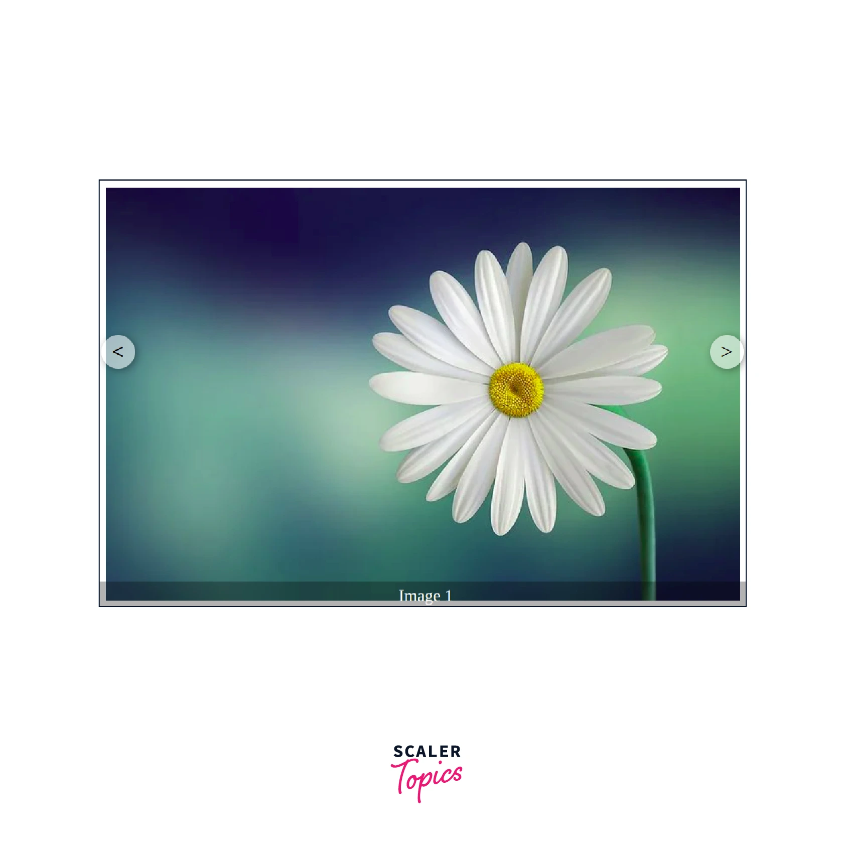
ステップ3: スライダーに必要な画像とテキストを追加する
ボタンを追加したら、次は画像を追加します。花の画像を使ってCSS画像スライダーを作成します。画像はpositionとz-indexを使って重ねて配置します。表示する必要がある画像は1枚だけなので、基本クラスを作成し、そのvisibilityをvisibleに設定します。残りの画像はユーザーに表示されないようにhiddenに設定します。.
スライダーには、ユーザーが現在閲覧している画像を示すテキストも表示されます。これにより、ユーザーはカルーセル内の画像の数と順序を把握しやすくなります。.
<!DOCTYPE html>
<html>
<head>
<title>Slider in CSS</title>
<style>

body{
background-color: rgb(58, 58, 58);
margin-top: 100px;
}
.carousel-container {
width: 600px;
height: 400px;
position: relative;
margin: 0 auto;

}

.navigation-buttons .previous {
position: absolute;
z-index: 10;
font-size: 25px;
top: 40%;
left: 10px;
font-weight: 700;
}

.navigation-buttons .next {
right: 10px;
position: absolute;
font-size: 25px;
z-index: 10;
top: 40%;
}

.navigation-buttons .nav-btn {
background: rgba(255, 255, 255, 0.55);
cursor: pointer;
border-radius: 50%;
width: 30px;
height: 30px;
display: flex;
justify-content: center;
align-items: center;
padding: 5px;
box-shadow: 2px 2px 10px rgba(0, 0, 0, 0.4);
}

.navigation .nav-btn:hover {
background: white;
}

.slider-carousel {
margin-top: 20px;
transition: all 0.3s ease;

}
.slider-carousel img {
width: 100%;
transition: all 0.3s ease;
border:8px solid white;
}

.images {
position: absolute;
display: none;
}

.main {
display: block;
}

.image-text {
position: absolute;
bottom: 0;
width: 103%;
display: flex;
font-size: 20px;
justify-content: center;
align-items: center;
color: rgb(255, 255, 255);
background: rgba(0, 0, 0, 0.3);
height: 35px;
}

</style>
</head>
<body>

<div id="parent-container">
<div class="navigation-buttons">
<div class="previous nav-btn"><</div>
<div class="next nav-btn">></div>
</div>

<div class="slider-carousel">
<div class="images main">
<img src="https://cdn.pixabay.com/photo/2015/04/19/08/32/marguerite-729510__480.jpg" alt="flower 1" />
<div class="image-text">Image 1</div>
</div>
<div class="images">
<img src="https://cdn.pixabay.com/photo/2014/02/27/16/10/tree-276014_960_720.jpg" alt="flower 2" />
<div class="image-text">Image 2</div>
</div>
<div class="images">
<img src="https://cdn.pixabay.com/photo/2015/04/23/22/00/tree-736885_960_720.jpg" alt="flower 3" />
<div class="image-text">Image 3</div>
</div>
</div>
</div>
</body>
</html>
出力
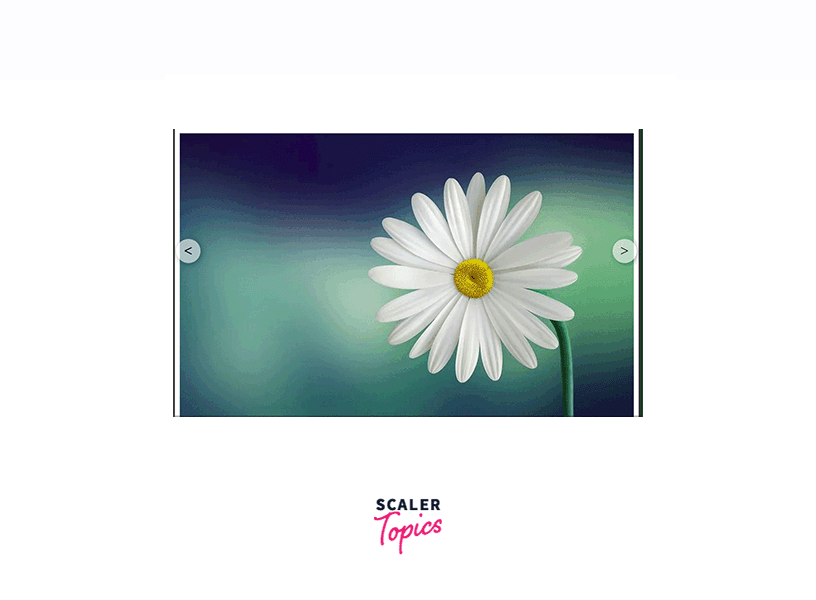
ステップ4: JavaScriptコードを使用して2つのボタンを有効にする
スライダークラスを作成し、すべての画像を追加しました。次に、「前へ」ボタンと「次へ」ボタンを有効にする必要があります。JavaScriptを使用します。.
まず、これらのボタンにイベントリスナーを追加する必要があります。ユーザーが「前へ」または「次へ」ボタンをクリックするたびに、そのボタンに関連付けられたアクションが実行されるようにします。では、どのように実装するのでしょうか?
ユーザーに表示する画像を指定するために、mainクラスを使用しました。次に、どの画像にこのクラスを割り当てるかを制御する必要があります。他の画像は非表示になり、mainクラスを持つ画像のみがユーザーに表示されます。これを実現するために、DOM操作を使用します。DOM操作は、既存の画像からmainクラスを削除し、新しい画像に追加するのに役立ちます。.
次に、どの画像に main クラスを割り当てるかを決定するために、「前へ」ボタンと「次へ」ボタンのイベント リスナーを使用します。まず、スライダー内のすべての画像を取得する必要があります。親スライダー カルーセルには複数の画像があることがわかります。これは、DOM のクエリ セレクターを使用して取得できます。すべての画像 div を取得したら、適切な画像を選択して main クラスを追加する必要があります。残りには main クラスがないため、ユーザーには表示されません。最初に 0 を指す変数を初期化できます。この変数は、現在ユーザーに表示されている画像を示します。ユーザーが「次へ」または「前へ」をクリックするたびに、それに応じて変数の値を増分または減分します。値が 0 で、ユーザーが前の値をクリックした場合、値は (div 内の画像の数 - 1) に変更されます。同様に、変数が最後の画像にあり、ユーザーが「次へ」をクリックした場合、値は 0 に変更されます。.
<!DOCTYPE html>
<html>
<head>
<title>Slider in CSS</title>
<style>

body{
background-color: rgb(58, 58, 58);
margin-top: 100px;
}
.carousel-container {
width: 600px;
height: 400px;
position: relative;
margin: 0 auto;

}

.navigation-buttons .previous {
position: absolute;
z-index: 10;
font-size: 25px;
top: 40%;
left: 10px;
font-weight: 700;
}

.navigation-buttons .next {
right: 10px;
position: absolute;
font-size: 25px;
z-index: 10;
top: 40%;
}

.navigation-buttons .nav-btn {
background: rgba(255, 255, 255, 0.55);
cursor: pointer;
border-radius: 50%;
width: 30px;
height: 30px;
display: flex;
justify-content: center;
align-items: center;
padding: 5px;
box-shadow: 2px 2px 10px rgba(0, 0, 0, 0.4);
}

.navigation .nav-btn:hover {
background: white;
}

.slider-carousel {
margin-top: 20px;
transition: all 0.3s ease;

}
.slider-carousel img {
width: 100%;
transition: all 0.3s ease;
border:8px solid white;
}

.images {
position: absolute;
display: none;
}

.main {
display: block;
}

.image-text {
position: absolute;
bottom: 0;
width: 103%;
display: flex;
font-size: 20px;
justify-content: center;
align-items: center;
color: rgb(255, 255, 255);
background: rgba(0, 0, 0, 0.3);
height: 35px;
}

</style>
</head>
<body>

<div id="parent-container">

<div class="navigation-buttons">
<div class="previous nav-btn"><</div>
<div class="next nav-btn">></div>
</div>

<div class="slider-carousel">
<div class="images main">
<img src="https://cdn.pixabay.com/photo/2015/04/19/08/32/marguerite-729510__480.jpg" alt="flower 1" />
<div class="image-text">Image 1</div>
</div>
<div class="images">
<img src="https://cdn.pixabay.com/photo/2014/02/27/16/10/tree-276014_960_720.jpg" alt="flower 2" />
<div class="image-text">Image 2</div>
</div>
<div class="images">
<img src="https://cdn.pixabay.com/photo/2015/04/23/22/00/tree-736885_960_720.jpg" alt="flower 3" />
<div class="image-text">Image 3</div>
</div>
</div>

</div>

<script>

const previous = document.querySelector('.previous');
const next = document.querySelector('.next');
const images = document.querySelector('.slider-carousel').children;
const totalImages = images.length;
let currentIndex = 0;


// Event Listeners to previous and next buttons
previous.addEventListener('click', () => {
previousImage()
})

next.addEventListener('click', () => {
nextImage();
})


// Function to go to next Image
function nextImage(){

images[currentIndex].classList.remove('main');
if(currentIndex == totalImages-1){
currentIndex = 0;
}
else{
currentIndex++;
}

images[currentIndex].classList.add('main');

}

// Function to go to previous Image
function previousImage(){

images[currentIndex].classList.remove('main');
if(currentIndex == 0){
currentIndex = totalImages-1;
}
else{
currentIndex--;
}

images[currentIndex].classList.add('main');

}

</script>

</body>
</html>
出力
おめでとうございます。HTML、CSS、JavaScript を使用して CSS スライダーを作成しました。.
スライドショー機能
現在、当社のスライダーは手動で操作しています。つまり、ユーザーが「前へ」または「次へ」ボタンをクリックするまで画像は切り替わりません。しかし、オンラインで入手できるほとんどのスライダーはこのように動作しません。これらのスライダーはスライドショー効果を備えており、一定時間後に自動的にフレームが切り替わります。.
スライダーでも同じことができます。JavaScript を使って setInterval 関数を使うと、指定した時間後に次の関数を自動的に呼び出すことができます。これにより、スライダーが自動的に動作し、指定した時間後にスライダーの位置が変更されます。.
<!DOCTYPE html>
<html>
<head>
<title>Slider in CSS</title>
<style>

body{
background-color: rgb(58, 58, 58);
margin-top: 100px;
}
.carousel-container {
width: 600px;
height: 400px;
position: relative;
margin: 0 auto;

}

.navigation-buttons .previous {
position: absolute;
z-index: 10;
font-size: 25px;
top: 40%;
left: 10px;
font-weight: 700;
}

.navigation-buttons .next {
right: 10px;
position: absolute;
font-size: 25px;
z-index: 10;
top: 40%;
}

.navigation-buttons .nav-btn {
background: rgba(255, 255, 255, 0.55);
cursor: pointer;
border-radius: 50%;
width: 30px;
height: 30px;
display: flex;
justify-content: center;
align-items: center;
padding: 5px;
box-shadow: 2px 2px 10px rgba(0, 0, 0, 0.4);
}

.navigation .nav-btn:hover {
background: white;
}

.slider-carousel {
margin-top: 20px;
transition: all 0.3s ease;

}
.slider-carousel img {
width: 100%;
transition: all 0.3s ease;
border:8px solid white;
}

.images {
position: absolute;
display: none;
}

.main {
display: block;
}

.image-text {
position: absolute;
bottom: 0;
width: 103%;
display: flex;
font-size: 20px;
justify-content: center;
align-items: center;
color: rgb(255, 255, 255);
background: rgba(0, 0, 0, 0.3);
height: 35px;
}

</style>
</head>
<body>

<div id="parent-container">

<div class="navigation-buttons">
<div class="previous nav-btn"><</div>
<div class="next nav-btn">></div>
</div>

<div class="slider-carousel">
<div class="images main">
<img src="https://cdn.pixabay.com/photo/2015/04/19/08/32/marguerite-729510__480.jpg" alt="flower 1" />
<div class="image-text">Image 1</div>
</div>
<div class="images">
<img src="https://cdn.pixabay.com/photo/2014/02/27/16/10/tree-276014_960_720.jpg" alt="flower 2" />
<div class="image-text">Image 2</div>
</div>
<div class="images">
<img src="https://cdn.pixabay.com/photo/2015/04/23/22/00/tree-736885_960_720.jpg" alt="flower 3" />
<div class="image-text">Image 3</div>
</div>
</div>

</div>

<script>

const previous = document.querySelector('.previous');
const next = document.querySelector('.next');
const images = document.querySelector('.slider-carousel').children;
const totalImages = images.length;
let currentIndex = 0;


// Event Listeners to previous and next buttons
previous.addEventListener('click', () => {
previousImage()
})

next.addEventListener('click', () => {
nextImage();
})

setInterval(()=>{
nextImage();
},1000);

// Function to go to next Image
function nextImage(){

images[currentIndex].classList.remove('main');
if(currentIndex == totalImages-1){
currentIndex = 0;
}
else{
currentIndex++;
}

images[currentIndex].classList.add('main');

}

// Function to go to previous Image
function previousImage(){

images[currentIndex].classList.remove('main');
if(currentIndex == 0){
currentIndex = totalImages-1;
}
else{
currentIndex--;
}

images[currentIndex].classList.add('main');

}

</script>

</body>
</html>
出力
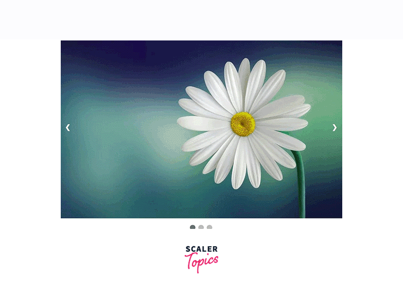
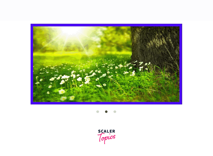
ナビゲーションポイント
スライダーでは、タイトルや画像テキストに加え、ナビゲーションドットも使用できます。ナビゲーションドットはテキストやタイトルと同様に機能し、ユーザーに現在どのフレームにいるのかを示します。ナビゲーションドットは便利で簡単に作成できるため、多くの最新のスライダーで使用されています。ナビゲーションドットは、ほとんどの場合、ラジオボタンです。.
ナビゲーションポイントを使用する利点は、ユーザーがスライダーの各フレームに簡単にアクセスできることです。従来のスライダーではユーザーが各画像を1つずつアクセスする必要がありましたが、ナビゲーションポイントでは、画像に対応するナビゲーションポイントをクリックするだけで、各フレームまたは画像にアクセスできます。.
ナビゲーションポイントの基本原理は、スライド画像と似ています。現在の画像には、対応するナビゲーションボタンがあり、アクティブクラスが設定されています。画像が変更されると、アクティブクラスは現在の画像と現在のナビゲーションポイントに移動または追加されます。.
<!DOCTYPE html>
<html>
<head>
<meta name="viewport" content="width=device-width, initial-scale=1">
<style>
* {box-sizing: border-box}

body {font-family: Verdana, sans-serif; margin:0}

.images {display: none}

img {
vertical-align: middle;
width:100%;
}

/* Slideshow container */
.carousel-container {
max-width: 1000px;
position: relative;
margin: auto;
}

/* Next & previous buttons */
.previous, .next {
cursor: pointer;
position: absolute;
top: 50%;
width: auto;
padding: 16px;
margin-top: -22px;
color: white;
font-weight: bold;
font-size: 18px;
transition: 0.6s ease;
border-radius: 0 3px 3px 0;
user-select: none;
}

/* Position the "next button" to the right */
.next {
right: 0;
border-radius: 3px 0 0 3px;
}


/* On hover, add a black background color with a little bit seethrough */
.prev:hover, .next:hover {
background-color: rgba(0,0,0,0.8);
}


/* The dots/bullets/indicators */
.navigation-dot {
cursor: pointer;
height: 15px;
width: 15px;
margin: 0 2px;
background-color: #bbb;
border-radius: 50%;
display: inline-block;
transition: background-color 0.6s ease;
}
.active, .navigation-dot:hover {
background-color: #717171;
}
</style>
</head>
<body>
<div class="carousel-container">
<div class="images fade">
<img src="https://cdn.pixabay.com/photo/2015/04/19/08/32/marguerite-729510__480.jpg">
</div>
<div class="images fade">
<img src="https://cdn.pixabay.com/photo/2014/02/27/16/10/tree-276014_960_720.jpg">
</div>
<div class="images fade">
<img src="https://cdn.pixabay.com/photo/2015/04/23/22/00/tree-736885_960_720.jpg">
</div>

<!-- Previous and Next Buttons -->
<a class="previous" onclick="plusSlides(-1)">❮</a>
<a class="next" onclick="plusSlides(1)">❯</a>
</div>
<br>

<!-- Navigation Dots-->
<div style="text-align:center">
<span class="navigation-dot" onclick="currentSlide(1)"></span>
<span class="navigation-dot" onclick="currentSlide(2)"></span>
<span class="navigation-dot" onclick="currentSlide(3)"></span>
</div>
<script>
var currentIndex = 1;

//Show current image
showSlides(currentIndex);

//Function to move Next
function plusSlides(n) {
showSlides(currentIndex += n);
}

//Function to move back
function currentSlide(n) {
showSlides(currentIndex = n);
}


//Initiate moving of slides
function showSlides(n) {
var i;
var slides = document.getElementsByClassName("images");
var dots = document.getElementsByClassName("navigation-dot");
if (n > slides.length) {currentIndex = 1}
if (n < 1) {currentIndex = slides.length}
for (i = 0; i < slides.length; i++) {
slides[i].style.display = "none";
}
for (i = 0; i < dots.length; i++) {
dots[i].className = dots[i].className.replace(" active", "");
}
slides[currentIndex-1].style.display = "block";
dots[currentIndex-1].className += " active";
}
</script>
</body>
</html>
出力

代替例
JavaScriptを使用して作成されたスライダーは、ブラウザでJavaScriptが有効になっている限りは問題ありません。ユーザーがJavaScriptをオフにすると、スライダーの機能を実現するためにJavaScriptが使用されているため、スライダーは動作しなくなります。.
スライダーを作成するのにJavaScriptを使う必要はありません。HTMLとCSSだけでも作成できます。必要なのは、ユーザーが「前へ」または「次へ」ボタンをクリックした際にどのように動作するかを理解することだけです。HTMLとCSSで作成したスライダーはブラウザのメモリ使用量が少なく、ブラウザでJavaScriptが無効になっている場合でも動作します。.
これらの属性とプロパティを使用して、アクティブクラスを作成できます。ナビゲーションボタンの場合、ボタンがクリックされたとき、またはマウスオーバーされたときに動作するアクティブクラスを作成できます。これはJavaScriptと似た動作ですが、DOM操作ではなく、targetなどのCSS関数を使用します。.
HTMLとCSSを使ってサンプルスライダーを作成しました。checkなどの擬似アクティブクラスを使用して、ユーザーが最近クリックしたナビゲーションポイントを特定し、それに応じて画像を表示します。画像を非表示にしないため、各画像にマージンとパディングを設定しています。.
<!DOCTYPE html>
<html>

<head>
<title> Slider using HTML and CSS </title>
<style>

img{
height:100%;
width:100%;
}

#frame {
margin: 0 auto;
height:400px;
width: 600px;
max-width: 100%;
}

#frame input[type=radio] {

display: none;
}

#frame label {
cursor: pointer;
text-decoration: none;
}

#slides {
padding: 10px;
background: #00F;
position: relative;
z-index: 1;
}

#overflow {
width: 100%;
overflow: hidden;
}

#frame1:checked~#slides .inner {
margin-left: 0;
}

#frame2:checked~#slides .inner {
margin-left: -100%;
}

#frame3:checked~#slides .inner {
margin-left: -200%;
}

#slides .inner {
transition: margin-left 800ms
cubic-bezier(0.770, 0.000, 0.175, 1.000);
width: 400%;
line-height: 0;
height: 300px;
}

#slides .frame {
width: 25%;
float: left;
display: flex;
justify-content: center;
align-items: center;
height: 100%;
color: black;
}

#controls {
margin: -180px 0 0 0;
width: 100%;
height: 50px;
z-index: 3;
position: relative;
}

#controls label {
transition: opacity 0.2s ease-out;
display: none;
width: 50px;
height: 50px;
opacity: .4;
}

#controls label:hover {
opacity: 1;
}

/* active class for images*/
#frame1:checked~#controls label:nth-child(2),
#frame2:checked~#controls label:nth-child(3),
#frame3:checked~#controls label:nth-child(1){
float: right;
margin: 0 -50px 0 0;
display: block;
}

/* active class for navigation button*/
#frame1:checked~#controls label:nth-last-child(2),
#frame2:checked~#controls label:nth-last-child(3),
#frame3:checked~#controls label:nth-last-child(1){
float: left;
margin: 0 0 0 -50px;
display: block;
}

#bullets {
margin: 150px 0 0;
text-align: center;
}

#bullets label {
display: inline-block;
width: 10px;
height: 10px;
border-radius: 100%;
background: #ccc;
margin: 0 10px;
}

#frame1:checked~#bullets label:nth-child(1),
#frame2:checked~#bullets label:nth-child(2),
#frame3:checked~#bullets label:nth-child(3){
background: #444;
}

</style>
</head>

<body>
<div id="frame">
<input type="radio" name="frame" id="frame1" checked />
<input type="radio" name="frame" id="frame2" />
<input type="radio" name="frame" id="frame3" />
<div id="slides">
<div id="overflow">
<div class="inner">
<div class="frame">
<img src="https://cdn.pixabay.com/photo/2015/04/19/08/32/marguerite-729510__480.jpg">
</div>
<div class="frame">
<img src="https://cdn.pixabay.com/photo/2014/02/27/16/10/tree-276014_960_720.jpg">
</div>
<div class="frame">
<img src="https://cdn.pixabay.com/photo/2015/04/23/22/00/tree-736885_960_720.jpg">
</div>
</div>
</div>
</div>
<div id="controls">
<label for="frame1"></label>
<label for="frame2"></label>
<label for="frame3"></label>
</div>
<div id="bullets">
<label for="frame1"></label>
<label for="frame2"></label>
<label for="frame3"></label>
</div>
</div>
</body>

</html>
出力
結果
- スライダーは一連のフレームであり、各フレームを順番にスクロールすることができます。.
- 現在、多くのウェブサイトではコメントや推薦文を表示するために使用されています。.
- スライダーを作成するには、ユーザーは HTML タグなどの概念、スタッキングや配置などの CSS の概念、変数や DOM 操作などの基本的な JavaScript を理解している必要があります。.
- スライダーは、アクティブクラスを持つ要素を表示することで機能します。残りのフレームはオフに表示されます。ユーザーがボタンまたはポイントにマウスオーバーすると、DOM操作を使用してアクティブクラスを持つ要素を変更します。.
- ユーザーがブラウザで JavaScript を有効にしていない場合、スライダーは機能しません。.
- HTMLとCSSだけでスライダーを作成できます。これにより、ブラウザのメモリと計算時間を節約できます。また、HTMLとCSSをサポートするすべてのブラウザで動作します。.