Introduction
Our comprehensive guide to CSS flexbox layouts. This comprehensive guide explains everything about flexbox, focusing on all the different possible attributes for the parent element (flex container) and child elements (flex items). It also includes history, demos, templates, and a browser support chart.
Context
The Flexbox layout module (a W3C candidate recommendation from October 2017) aims to provide a more efficient way to arrange, align, and distribute space between items within a container, even when their size is unknown and/or dynamic (hence the word “flex”).
The main idea behind a flexible layout is to allow the container to change the width/height (and order) of its items to best fill the available space (mostly to accommodate a variety of display devices and screen sizes). A flexible container expands items to fill the available free space or shrinks them to prevent overflow.
Most importantly, the flexbox layout is directional, unlike regular layouts (a block that is vertically aligned and inline based on a horizontal layout). While they work well for pages, they lack the flexibility (no pun intended) to support large or complex applications (especially when it comes to changing orientation, resizing, stretching, shrinking, etc.).
Note: Flexbox layout is more suitable for application components and small-scale layouts, while Grid layout is intended for larger-scale layouts.
Basics and terminology
Since flexbox is a complete module and not a single feature, it includes a lot of things, including its entire set of properties. Some of them are meant to be set on the container (the parent element, known as the “flex container”) while others are meant to be set on the children (known as “flex items”).
If the “regular” layout is based on both block and inline flow directions, the flexible layout is based on “flexible flow directions.” Please take a look at this form of specification and it explains the main idea behind the flex layout.

Items are placed along the main axis (from the main start to the main end) or the cross axis (from the cross start to the cross end).
- Main axis – The main axis of the flex container is the primary axis along which flex items are placed. Be careful, it is not necessarily horizontal. It depends on the flex-direction property (see below).
- Main Start | Main End – Flexible items are placed inside the container starting from the main start and going to the main end.
- Original size – The width or height of a flex item, whichever is in the original dimension, is the original size of the item. The flex item's original size property is either the "width" or "height" property, whichever is in the original dimension.
- Cross axis – The axis perpendicular to the principal axis is called the cross axis. Its direction depends on the direction of the principal axis.
- Cross-start | cross-end – Flex lines are filled with items and placed in the container starting from the cross-start side of the flex container and moving towards the cross-end.
- Cross Size – The width or height of a flex item, whichever is in the cross dimension, is the cross size of the item. The cross size property is whichever is in the cross dimension, either “width” or “height”.
Flexbox Features
 Properties for parents
(container)
 Properties for parents
Display
This defines a flexible container. Depending on the given value, inline or block. It provides a flexible context for all its direct children.
.container {
display: flex; /* or inline-flex */
}
flex-direction

This creates the primary axis, thus determining the direction in which flex items are placed within the flex container. Flexbox (apart from optional wrapping) is a unidirectional layout concept. Think of flex items as being mostly in horizontal rows or vertical columns.
.container {
flex-direction: row | row-reverse | column | column-reverse;
}- ROW (default): Left to right in ltr. Right to left in rtl
- row-reverse: right-to-left in ltr. left-to-right in rtl
- COLUMN: Like row but from top to bottom
- Column-reverse: Like reverse row but from bottom to top
Flex Wrap

By default, flexible items all try to fit in one line. You can change that and allow items to be closed with this property if needed.
.container {
flex-wrap: nowrap | wrap | wrap-reverse;
}- nowrap (default): All flex items will be wrapped on one line
- wrap: Flexible items are wrapped across multiple lines, top to bottom.
- wrap-reverse: Flexible items are wrapped on multiple lines from bottom to top.
FLEX-Flow
This is a shorthand for the flex-direction and flex-width properties, which together specify the main and cross axes of the flex container. The default value is row nowrap.
.container {
flex-flow: column wrap;
}
Justify-Content

This specifies the alignment along the main axis. It helps distribute excess white space when all flexible items in a line are inflexible or flexible but have reached their maximum size. It also provides some control over the alignment of items when items overflow the line.
.container {
justify-content: flex-start | flex-end | center | space-between | space-around | space-evenly | start | end | left | right ... + safe | unsafe;
}- flex-start (default): Items are packed towards the start of the flex direction.
- flex-end: Items are packaged towards the end of the flex direction.
- START: Items are packed towards the start of the writing mode direction.
- END: Items are packed towards the end of the write mode direction.
- LEFT: Items are packed towards the left edge of the container, unless it doesn't make sense with the flex direction, then it acts like start.
- RIGHT: Items are packed towards the right edge of the container, unless it makes sense to be flexible in that direction, then it acts like the end.
- CENTER: Items are centered along the line.
- Space-Between: Items are evenly distributed in the line. The first item is at the start line, the last item is at the finish line.
- Space-Around: Items are evenly distributed in a line with equal space around them. Note that visually the spaces are not equal, as all items have equal space on both sides. The first item will have one unit of space at the edge of the container, but will have two units of space between the next item because the next item has its own spacing that is applied.
- Space-Evenly: Items are distributed in such a way that the distance between any two items (and the distance to the edges) is equal.
There are also two additional keywords you can pair with these values: safe and insecure. Using safe ensures that no matter how you do this type of positioning, you can't push an element so far off the page (e.g., off the top of the page) that the content can't be scrolled through (known as "data loss").
Align-Items

This defines the default behavior for how flexible items are arranged along the cross axis in the current line. Think of it as the content justification version for the cross axis (perpendicular to the main axis).
.container {
align-items: stretch | flex-start | flex-end | center | baseline | first baseline | last baseline | start | end | self-start | self-end + ... safe | unsafe;
}- STREtch (default): Stretch to fill the container (still respects min/max width)
- flex-start / start / self-start: Items are placed at the beginning of the cross-axis. The difference between these is subtle and is about respecting flex direction rules or writing mode rules.
- flex-end / end / self-end: Items are placed at the end of the cross-axis. The difference is again subtle and is about respecting flex direction rules versus writing mode rules.
- CENTER: Items are located on the cross axis
- BASEline: Items are aligned like their baselines
ALign-Content

When there is extra space on the cross axis, it aligns the flexible container lines inside, similar to how justify-content aligns individual items on the main axis.
.container {
align-content: flex-start | flex-end | center | space-between | space-around | space-evenly | stretch | start | end | baseline | first baseline | last baseline + ... safe | unsafe;
}- Normal (default): Items are packed in their default position as if no value was set.
- flex-start / start: Items wrapped to the beginning of the container. flex-start (with more support) indicates the flex direction while start respects the write mode direction.
- flex-end / end: Items that are wrapped to the end of the container. (More support) flex-end indicates the flex direction while end respects the write mode direction.
- CENTER: Items that are in the center of the container
- Space-Between: Items are evenly spaced. The first line is at the beginning of the container and the last line is at the end of the container.
- Space-Around: Items are evenly distributed with equal space around each line.
- Space-Evenly: Items are evenly distributed with equal space around them
- stretch: Lines are stretched to occupy the remaining space.
Gap, Row-Gap, Column-Gap

The gap property explicitly controls the space between flexible items. This spacing only applies between items, not on the outer edges.
.container {
display: flex;
...
gap: 10px;
gap: 10px 20px; /* row-gap column gap */
row-gap: 10px;
column-gap: 20px;
}
This behavior can be thought of as minimal guttering, such that if the gutter is somehow larger (due to something like justify-content: spacing-between; ) then this gap will only have an effect when that space becomes smaller.
This is not exclusive to flexbox, gaps also work in grid and multi-column layouts.
Flexbox prefix
Flexbox requires some vendor prefixes to support the most possible browsers. This doesn't just involve prepending attributes with the vendor prefix, but actually having completely different property names and values. This is because the Flexbox specification has changed over time, creating "old", "tweener" and "new" versions.
Perhaps the best way to handle this is to write with the new (and final) syntax and run your CSS through Autoprefixer, which makes good use of backspaces.
Alternatively, here's a Sass @mixin to help with some prefixes, which will also give you an idea of what kind of things to do:
@mixin flexbox() {
display: -webkit-box;
display: -moz-box;
display: -ms-flexbox;
display: -webkit-flex;
display: flex;
}
@mixin flex($values) {
-webkit-box-flex: $values;
-moz-box-flex: $values;
-webkit-flex: $values;
-ms-flex: $values;
flex: $values;
}
@mixin order($val) {
-webkit-box-ordinal-group: $val;
-moz-box-ordinal-group: $val;
-ms-flex-order: $val;
-webkit-order: $val;
order: $val;
}
.wrapper {
@include flexbox();
}
.item {
@include flex(1 200px);
@include order(2);
}
Examples
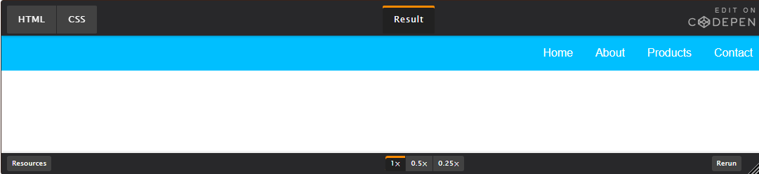
Let's start with a very, very simple example, solving an almost daily problem: perfect focus. It couldn't be simpler if you're using flexbox.
<ul class="navigation">
<li><a href="#">Home</a></li>
<li><a href="#">About</a></li>
<li><a href="#">Products</a></li>
<li><a href="#">Contact</a></li>
</ul>
.parent {
display: flex;
height: 300px; /* Or whatever */
}
.child {
width: 100px; /* Or whatever */
height: 100px; /* Or whatever */
margin: auto; /* Magic! */
}This is due to the fact that an auto-set margin in a flexible container will absorb extra space. So setting an auto-set margin will make the item perfectly centered on both axes.
Now let's use a few more properties. Consider a list of 6 items, all of which have fixed dimensions, but can be auto-sized. We want them to be evenly distributed on the horizontal axis so that when we resize the browser, everything scales nicely without any media requests.
.flex-container {
/* We first create a flex layout context */
display: flex;
/* Then we define the flow direction
and if we allow the items to wrap
* Remember this is the same as:
* flex-direction: row;
* flex-wrap: wrap;
*/
flex-flow: row wrap;
/* Then we define how is distributed the remaining space */
justify-content: space-around;
}
Done. Everything else is just a style concern. Below is a pen shown. Be sure to go to CodePen and resize your windows to see what happens.
Let's try something else. Imagine we have a right-aligned navigation element at the top of our website, but we want to center it on medium-sized screens and have a single column on small devices. It's simple enough.
/* Large */
.navigation {
display: flex;
flex-flow: row wrap;
/* This aligns items to the end line on main-axis */
justify-content: flex-end;
}
/* Medium screens */
@media all and (max-width: 800px) {
.navigation {
/* When on medium sized screens, we center it by evenly distributing empty space around items */
justify-content: space-around;
}
}
/* Small screens */
@media all and (max-width: 500px) {
.navigation {
/* On small screens, we are no longer using row direction but column */
flex-direction: column;
}
}
Let's try something better by playing with the flexibility of flexible items! What about a mobile-first 3-column layout with a full-width header and footer. And independent of source order.
<div class="wrapper">
<header class="header">Header</header>
<article class="main">
<p>Pellentesque habitant morbi tristique senectus et netus et malesuada fames ac turpis egestas. Vestibulum tortor quam, feugiat vitae, ultricies eget, tempor sit amet, ante. Donec eu libero sit amet quam egestas semper. Aenean ultricies mi vitae est. Mauris placerat eleifend leo.</p>
</article>
<aside class="aside aside-1">Aside 1</aside>
<aside class="aside aside-2">Aside 2</aside>
<footer class="footer">Footer</footer>
</div>
.wrapper {
display: flex;
flex-flow: row wrap;
}
/* We tell all items to be 100% width, via flex-basis */
.wrapper > * {
flex: 1 100%;
}
/* We rely on source order for mobile-first approach
* in this case:
* 1. header
* 2. article
* 3. aside 1
* 4. aside 2
* 5. footer
*/
/* Medium screens */
@media all and (min-width: 600px) {
/* We tell both sidebars to share a row */
.aside { flex: 1 auto; }
}
/* Large screens */
@media all and (min-width: 800px) {
/* We invert order of first sidebar and main
* And tell the main element to take twice as much width as the other two sidebars
*/
.main { flex: 3 0px; }
.aside-1 { order: 1; }
.main { order: 2; }
.aside-2 { order: 3; }
.footer { order: 4; }
}